
Satellite Creative recently commissioned me to shoot some new imagery for TRL's forthcoming website.
Sometime around the middle of last year I had been thinking about my brand. You know, me wrapped up in an identity with a fancy logo, perhaps some thought-provoking colours and a win-all strapline.
But I had no idea how hard it was to even start. Who’s it for? What should it say? What should it look like? What colours should I use and how are these interpreted by different people and across different cultures? Who are my clients now, but where should I be heading? Will it be future-proof?
I started looking at other photographers’ logos and branding but didn’t come away particularly inspired. Many of them felt 'off the shelf' and not really....me.
I’ve been working with the team from Satellite Creative for a while and have always liked their design work so naturally went to them and blurted out all the above questions.
We had a look at various fonts, discussed colours - which ones are cheap but impactful and which ones were subtle and high end. I wanted to keep the logo simple, clean and understated. We discussed lower case, upper case, shapes and tints and I must confess by the end my head was melting.
A few weeks later I was presented with eight options for my logo. Three of which I was happy to use straight away and one which was so, so close - but like all awkward customers I had an idea.
I was keen to explore the pros and cons of removing the cross bar from the letter A but was troubled that it may be confusing to the eye or may even be used in another alphabet. We toyed with moving it up and down and then taking it off the H for Hollier...
I showed the finished logo to my wife, friends and colleagues and everyone loved it - which was a great relief! It was important that it was something that represented me and with agreement from others it was time for the big launch.
And here it is heading up this page.
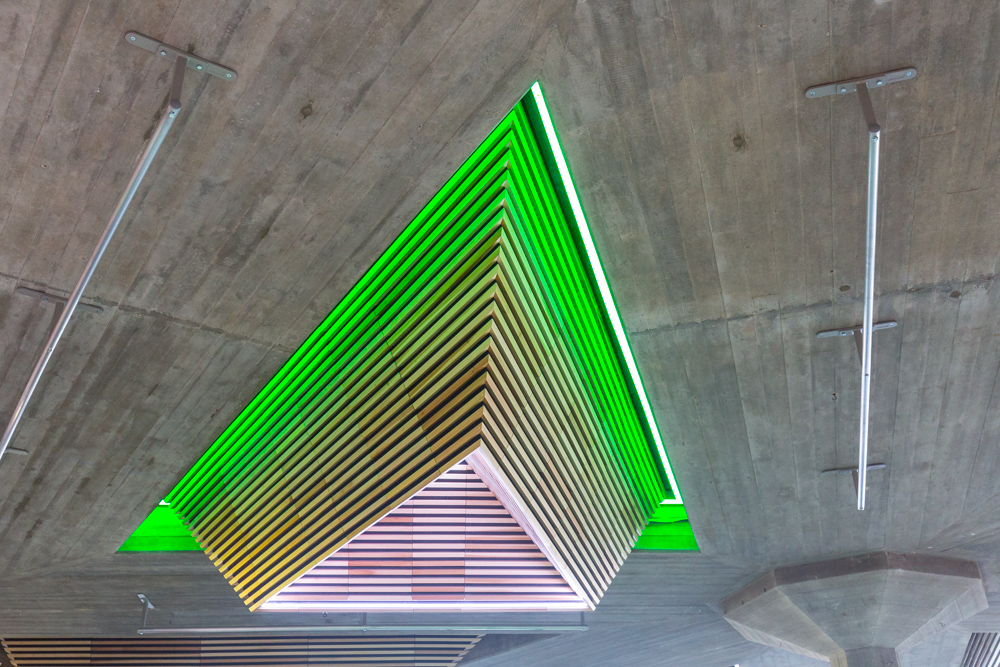
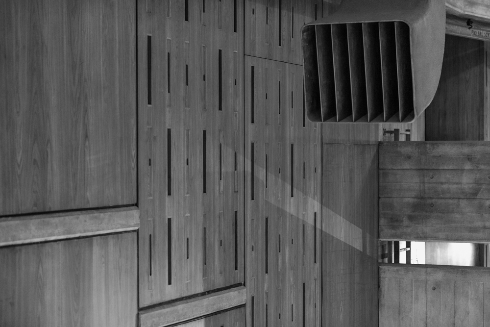
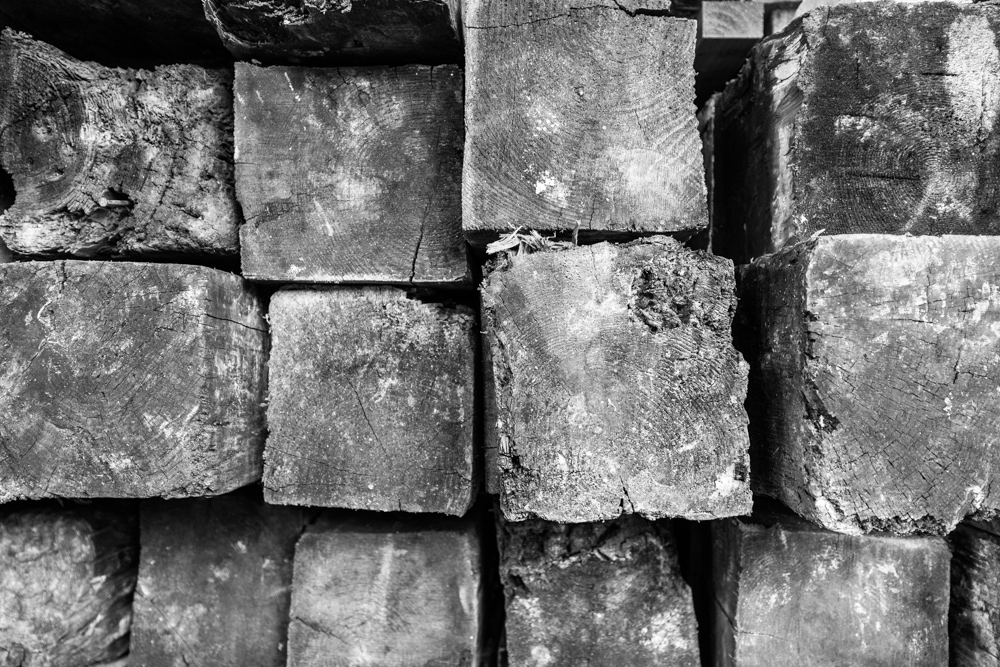
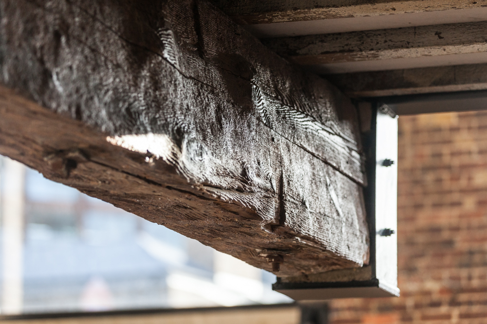
Some recent examples of building/construction projects.
Here’s what Viki Brockett, the account director of Satellite Creative had to say about the design: “We've been partnering with Adam for over three years now, so the team were very flattered when he approached us to help refresh his brand identity. The monogram is inspired by a camera's viewfinder, with the AH using the crossbar of the letters as the horizon line. We kept the line weights light and chose Avant Garde to create the logo - we felt both were confident yet discreet, which captures the very essence of Adam's persona.”
I found the whole experience definitely more enriching than just searching for fancy fonts and a flash design. The process of finding out who you are as a brand and how it may be seen by your customers involved a fair bit of soul searching and was very fulfilling.
But what’s this got to do with photography? Because the questions I asked myself about my brand are exactly the questions I ask new clients before undertaking their imagery. Anyone can take pictures, but the trick is knowing what to photograph.
Let's talk about the photography in your brand by calling me on 07801 414732 or email adam@adamhollier.co.uk